Ajattelin aluksi tehdä tuon esimerkin Metsä Boardista, mutta pistetääs nopeasti kyhätty Nokia tähän nyt näytille. Muistutus vielä että tässä ei ole ollenkaan huomioitu somea, fundia tai muita ulkoisia tekijöitä hinnan ulkopuolelta.
Masiinoille tuli syötettyä Nokian viimeisen 4v kurssitiedot (<18.7.2019). Jottai saisi idean siitä missä Nokia olisi muihin yhtiöihin nähden runnasin aluksi hintavertailun Nokiasta. Optimitilanteessa tämä tehtäisiin kilpailijoihin nähden, mutta runnasin tämän nyt muiden randomeiden kanssa joiden kurssitiedot olin jo nappaissut talteen. Nokian värjäsin punaisella jotta näkyy paremmin.
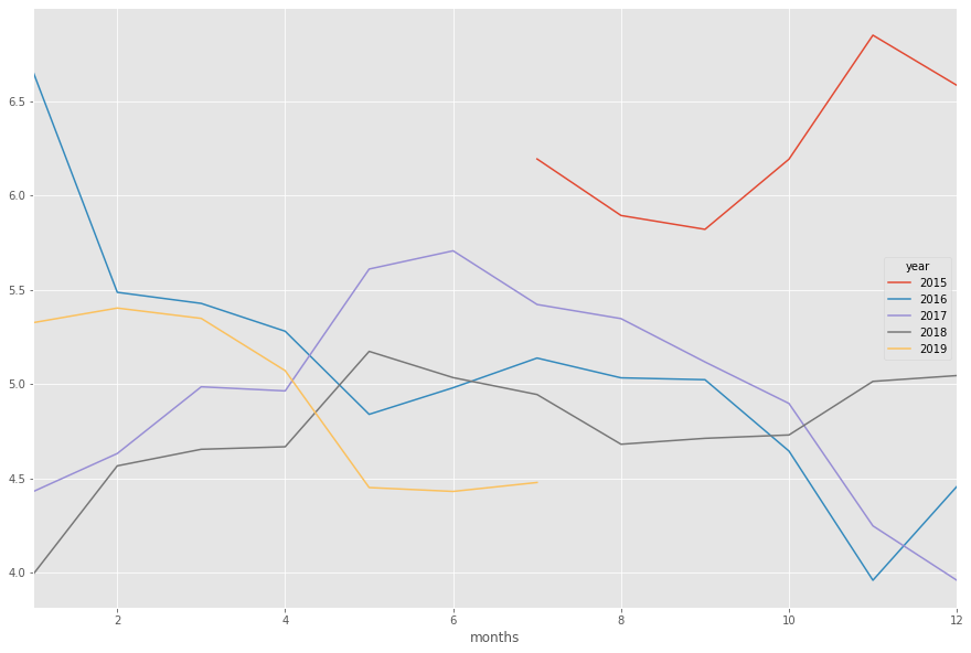
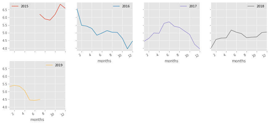
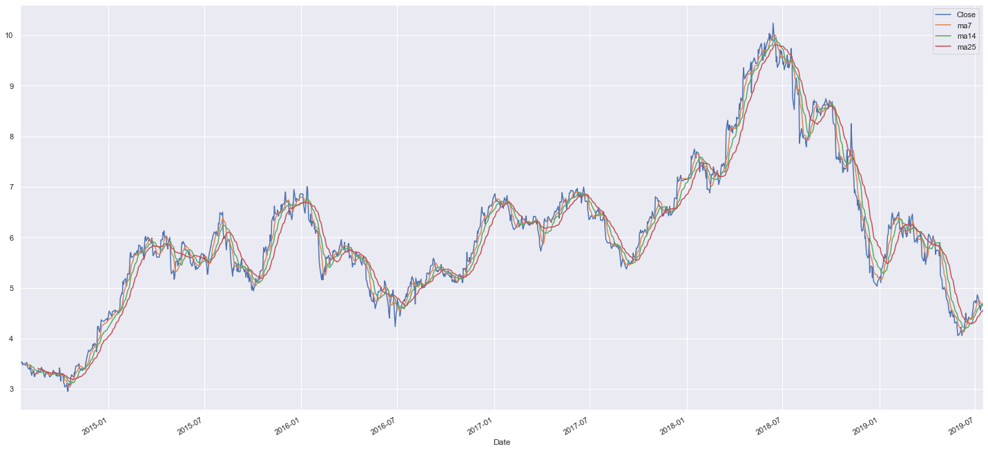
Kun tietää osakkeen position jotakuinkin muihin osakkeisiin nähden, voi sitä lähteä analysoimaan näkyvän datan kautta. Simppelein tapa arvioida suoritusta on vertailla vuosia keskenään, jotta löytää vahvat ja heikot ajat. Alla viimeiset 4v yhdessä kuvassa.
Eriteltynä toisistaan vuodet näyttävät tältä:
Vuoden vaihde siis usein on toiminut käännekohtana hinnassa. Tämä tieto on hyvä pitää mielessä, mutta se on vain observaatio jolla loppupeleissä emme tee tässä juuri sen kummempaa.
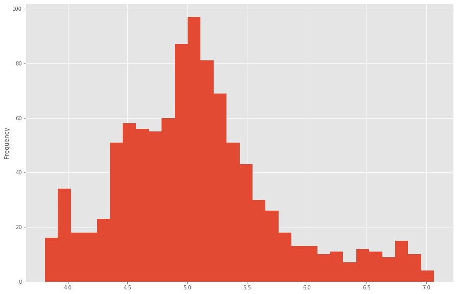
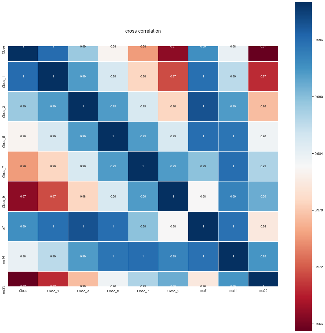
Mikä meitä kiinnostaa on osakkeen hintaprofiili. Profiili saadaan laskemalla yleisin hintataso osakkeelle:
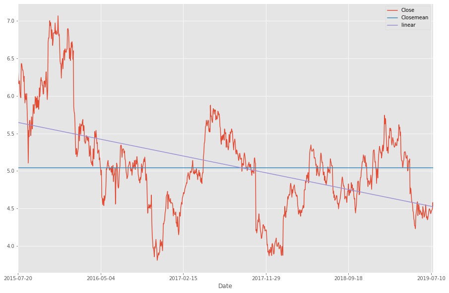
Ilmeisestikin nokian yleisin taso on vitosen kummallakin puolella. Tarkennus tähän saadaan 4v keskiarvosta laskemalla CloseMean, eli sulkuhinnan keskiarvotaso.
Lisäämällä kuvaan myös lineaarisen keskiarvon huomaamme, että keskiarvollisesti Nokia on ollut laskussa viimeiset 4 vuotta.
Käyttäen avuksi lineaarista keskiarvoa voimme myös illustroida miltä kurssi näyttää keskiarvoiseen luisumiseen nähden:
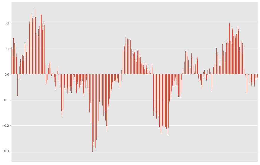
Tästä laskutoimituksesta saa myös kyhättyä indikaattorin hintojen tarkkailuun tarvittaessa.
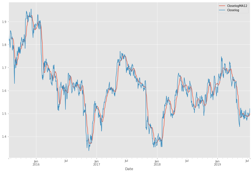
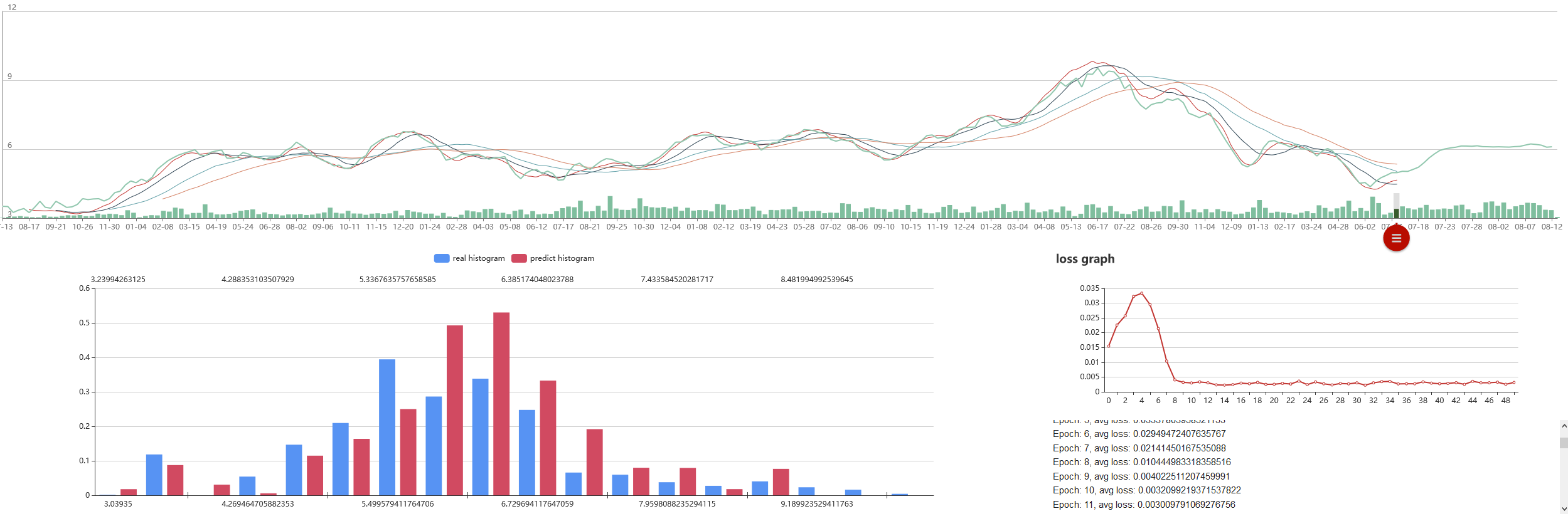
Lisäämällä kartalle MA12:n saamme seuraavan kuvan, jonka tuloksia käytämme tulevaisuudessa:
Ja se tulevaisuus tulee tässä. Eli käyttäen avuksi MA12:sta ja sulkuhintoja voimme laskea ja visualisoida keskiarvon kurssin suunnalle sekä keskiarvon kurssipoikkeamat (suomenkielen hienouksia). Teknisesti ottaen kuvassa näette siis mustan standardina, sekä sinisen sulkuhintana ja oranssin MA12:na. Mollivoittoisuus näkyy.
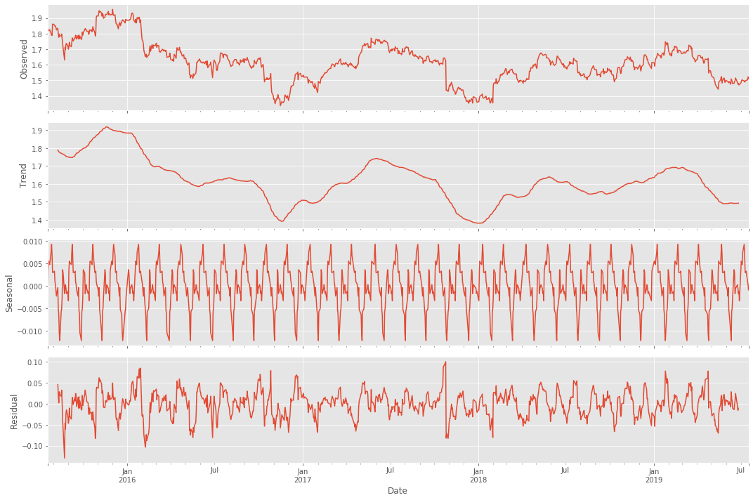
Mitä tämä tarkoittaa siis itse osakkeessa? Saako tätä jotenkin järkevämmän oloiseksi tavalliselle tallaajalle? Päivämäärien, hintojen sekä algojen ansiosta saadaan datasta siistittyä myös kausiluontoiset hintamuutokset:
Selvin kuvio lienee alas päin viettävä trend, ja mielenkiintoisin lienee seasonal eli kausiluontoinen poikkelehtiminen. Parin päivän päästä ollaan graafin mukaan ilmeisesti taas hetkellisissä pohjissa.
Mutta! Tarkoittaako tämä sitä että kannattaisi ostaa?
Tuo on kaikille henkilökohtainen kysymys ja riippuu henkilöstä itsestään. Itse odotan mielelläni, että kaikki tähdet astuvat riviin mikäli pitää ostopäätös tehdä. Ylireagoinnin toteaminen kurssissa on joissakin tapauksissa hyödyllistä:
Edellinen ylireagointi tapahtui siis keväällä kun hinta kävi 4,23:ssa. Tämä olisi ollut hyvä hetki pistää pilkki ulos.
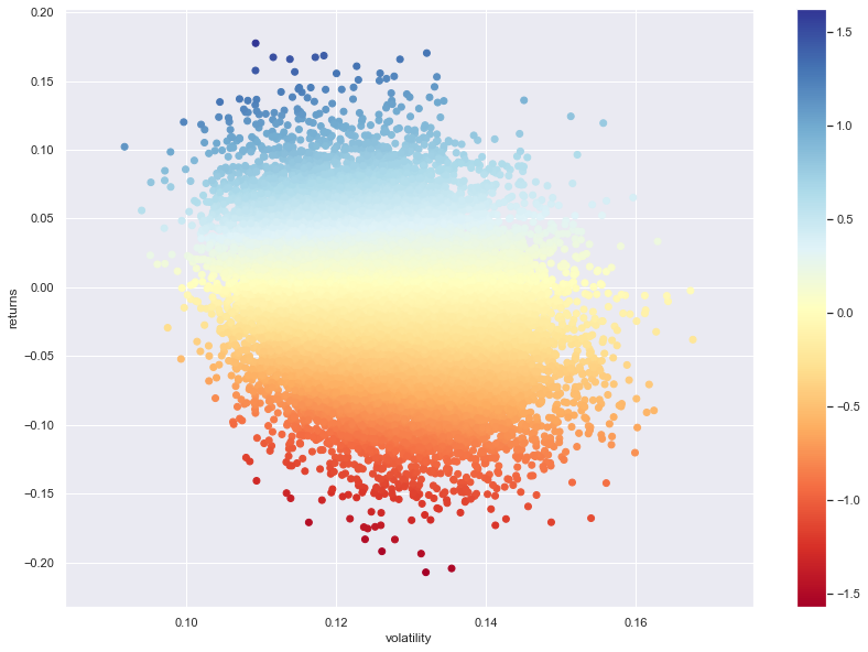
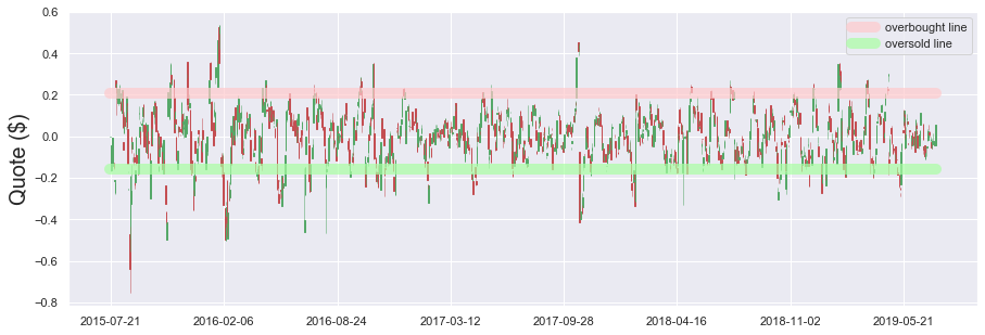
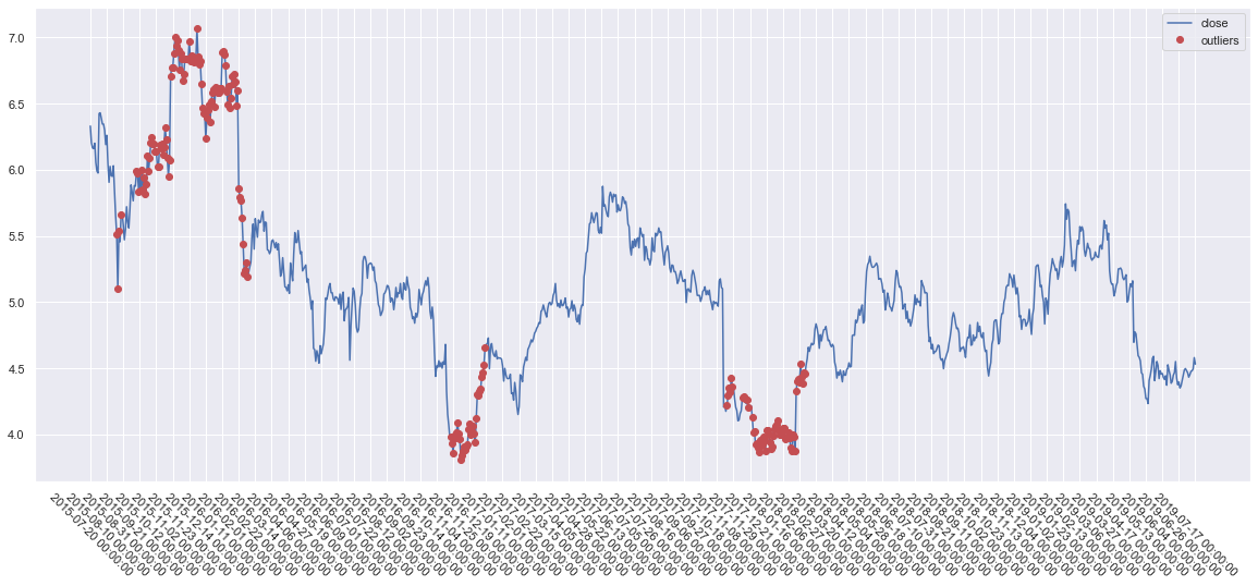
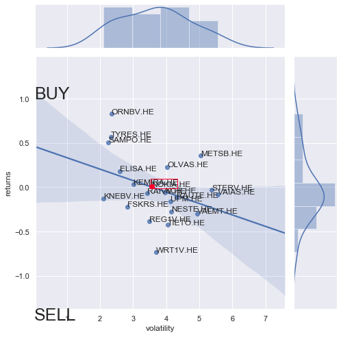
Miten osake käyttäytyy sitten eri hintatasoilla? Volaa/scatteria hinnassa voidaan kuvata seuraavasti:
Stabiileinta hinta on 4,2 - 5,8 eur välillä.
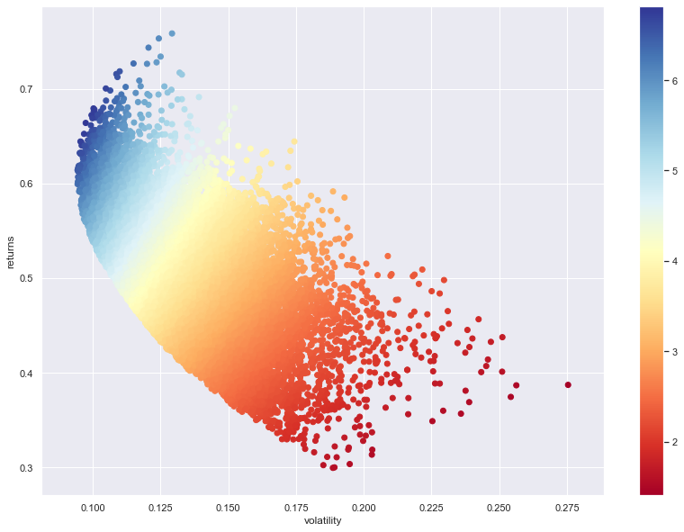
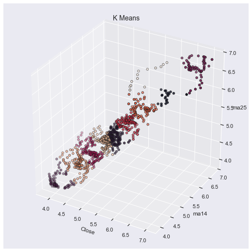
3D-kuvaksi käännettynä:
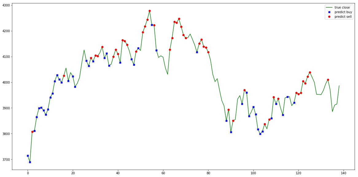
Mistä algo tunnistaisi ostopaikoija?
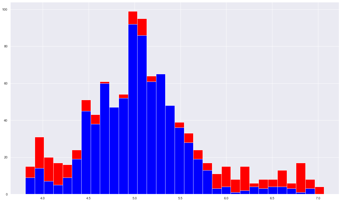
Tämä riippuu algosta mikä on käytössä. Mikäli algo perustuu anomaliteetteihin hinnassa ja pyrkii normaalistasoon, eli siis tunnistaa ääripäät hinnassa ja myy tämän perusteella, outputti voisi näyttää seuraavalta:
Tämä käännettynä pilarigraafiksi kertoo otollisimmat osto - ja myyntitilaisuudet 4:n vuoden aikana:
Eli mitä vähemmän punaista sitä rauhallisempaa ja riskittömämpää liikehdintä on ollut. Punaiset kuvaavat ylläolevan kuvan pisteitä ja sininen hintatasoa.
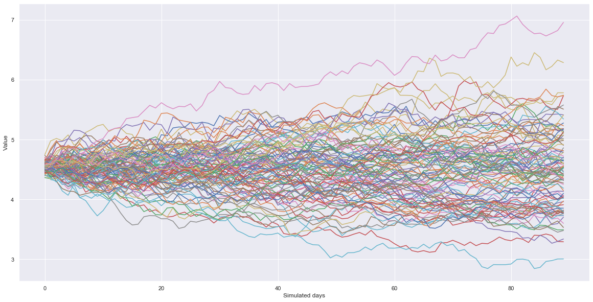
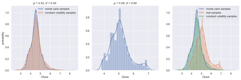
Tuloksien kartoittamisessa voidaan käyttää myös Monte Carlon simulaatiomenetelmää, mikä on tietääkseni käytössä mm. sääennustuksissa. Menetelmästä voi lukea lisää wikipediasta.
Lyhykäisyydessään, simulaatio rakentaa annetun määrän verran randomeita ennusteita joita voi karsia pois todennäköisyyden mukaan. En tässä analyysissä käytä menetelmää muuta kuin demo-mielessä. Alla demonstroituna 100 todennäköisintä reittiä kurssille 4 vuoden datan persuteella.
Tämäkin on paljon helpommin luettavissa pylväiköstä:
Ei varsinaisesti sijoitusstrategia, mutta antaa hyvän kuvan siitä mitä tulevaisuudelta voi odottaa yhdistämällä tämä kaikkeen muuhun dataan mitä ylhäällä on käyty läpi.
Mutta mutta! Missä vaiheessa katsellaan algojen tuloksia?
Kattellaan niitä nyt sitten niin.
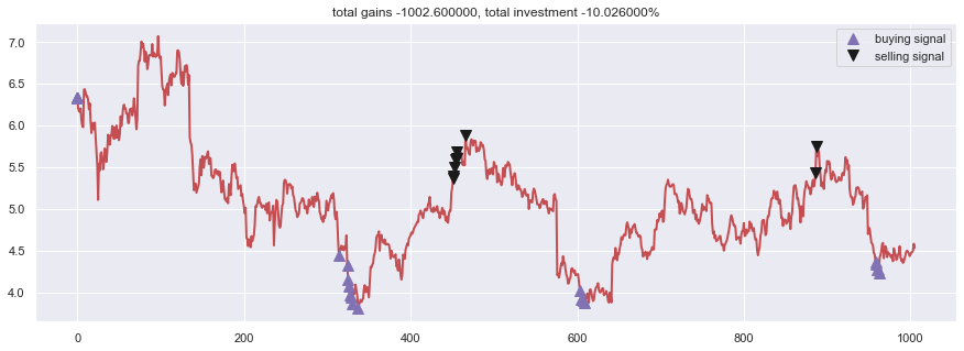
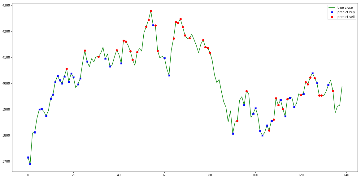
Itse käytän mielelläni kombinaatiota kahdesta eri algosta. Toinen pohjautuu itse Legendan, Richard Dennissin oppeihin (kts. Turtle strategy) eli trendin muutoksiin, ja toinen ABCD-kuvioon pörssissä.
Alla ensimmäisenä mainittu. Sääntöinä: Max ostot: 200, Max myynnit: 1000:
day 314: buy 200 units at price 887.600000, total balance 9112.400000 (INV 200 )
day 324: buy 200 units at price 864.800000, total balance 8247.600000 (INV 400 )
day 325: buy 200 units at price 830.000000, total balance 7417.600000 (INV 600 )
day 326: buy 200 units at price 813.600000, total balance 6604.000000 (INV 800 )
day 327: buy 200 units at price 794.400000, total balance 5809.600000 (INV 1000 )
day 329: buy 200 units at price 787.200000, total balance 5022.400000 (INV 1200 )
day 330: buy 200 units at price 771.600000, total balance 4250.800000 (INV 1400 )
day 337: buy 200 units at price 762.000000, total balance 3488.800000 (INV 1600 )
day 451, sell 1000 units at price 5370.000000, investment 40.944882 %, total balance 8858.800000, (INV 600 )
day 452, sell 600 units at price 3231.000000, investment 41.338583 %, total balance 12089.800000, (INV 0 )
day 453: cannot sell anything, inventory 0
day 454: cannot sell anything, inventory 0
day 455: cannot sell anything, inventory 0
day 456: cannot sell anything, inventory 0
day 466: cannot sell anything, inventory 0
day 603: buy 200 units at price 802.800000, total balance 11287.000000 (INV 200 )
day 605: buy 200 units at price 784.000000, total balance 10503.000000 (INV 400 )
day 607: buy 200 units at price 780.000000, total balance 9723.000000 (INV 600 )
day 608: buy 200 units at price 774.000000, total balance 8949.000000 (INV 800 )
day 886, sell 800 units at price 4344.000000, investment 40.310078 %, total balance 13293.000000, (INV 0 )
day 887: cannot sell anything, inventory 0
day 958: buy 200 units at price 872.800000, total balance 12420.200000 (INV 200 )
day 959: buy 200 units at price 868.400000, total balance 11551.800000 (INV 400 )
day 960: buy 200 units at price 854.200000, total balance 10697.600000 (INV 600 )
day 961: buy 200 units at price 853.700000, total balance 9843.900000 (INV 800 )
day 962: buy 200 units at price 846.500000, total balance 8997.400000 (INV 1000 )
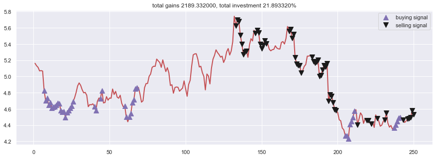
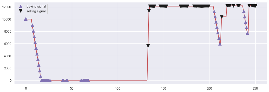
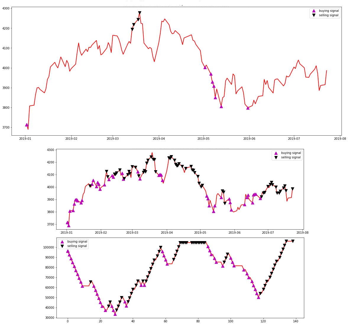
Ja alla kuva ABCD:n tuloksista kartalla:
Sekä indikaattorimuodossa:
Erona näillä kahdella on se, kuten tarkkasilmäisimmät ovatkin huomanneet, että ensimmäinen sopii pitkille aikaväleille ja toinen keskipitkille aikaväleille. Ensimmäisessä käytänkin 4v dataa ja ABCD:ssä 1v dataa.
Heitän sen metsä been tänne viel jossain välissä.
Ja ihmeessä, jos tulee mieleen hyviä strategioita ja huomioita niin huudelkaa.